History and Context
The history of typeface design is a mix of artistic desires and practical needs. Crafting something beautiful, functional, and usable required understanding of design, printmaking, and optics to execute. The creation of Western movable type and the printing press in the 15th century was the starting point for modern type design.
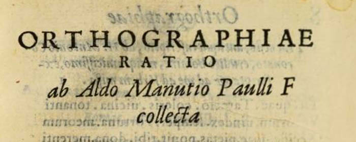
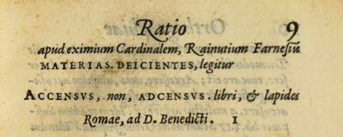
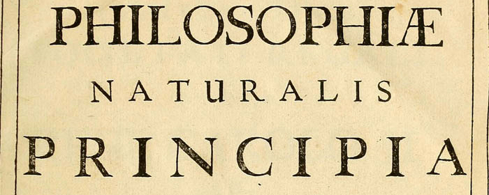
Stickley 2 is a humanist, old style–rooted design with a contemporary execution and broad OpenType abilities. Specimens and pages of centuries-old master typeface designs such as Jenson, Garamond, and Caslon were examined and dissected to find interesting and exceptional insiprations to reference and develop, redesign, and integrate with modern technologies.
Stickley 2 is a humanist, old style–rooted design with a contemporary execution and broad OpenType abilities. Specimens and pages of centuries-old master typeface designs such as Jenson, Garamond, and Caslon were examined and dissected to find interesting and exceptional insiprations to reference and develop, redesign, and integrate with modern technologies.
Optical Design
Typefaces were originally designed for the physical size at which they were to be printed, with subtle variations in proportion, detail, contrast, and visual weight to ensure they were as clear at 6 pt. as they were elegant at 68 pt. This creates a unified design as the various sizes were set together on a page.

Proportions
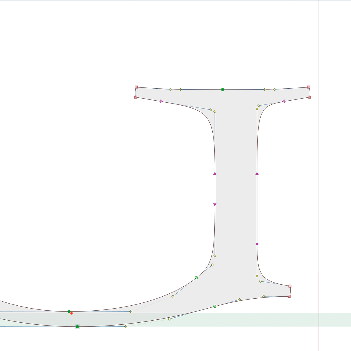
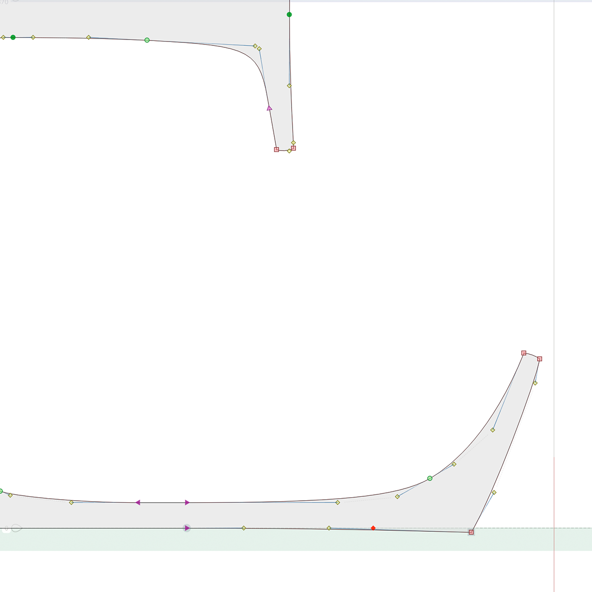
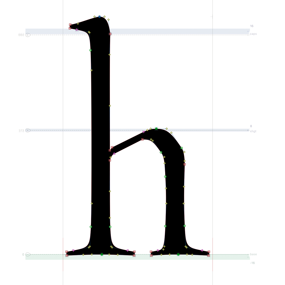
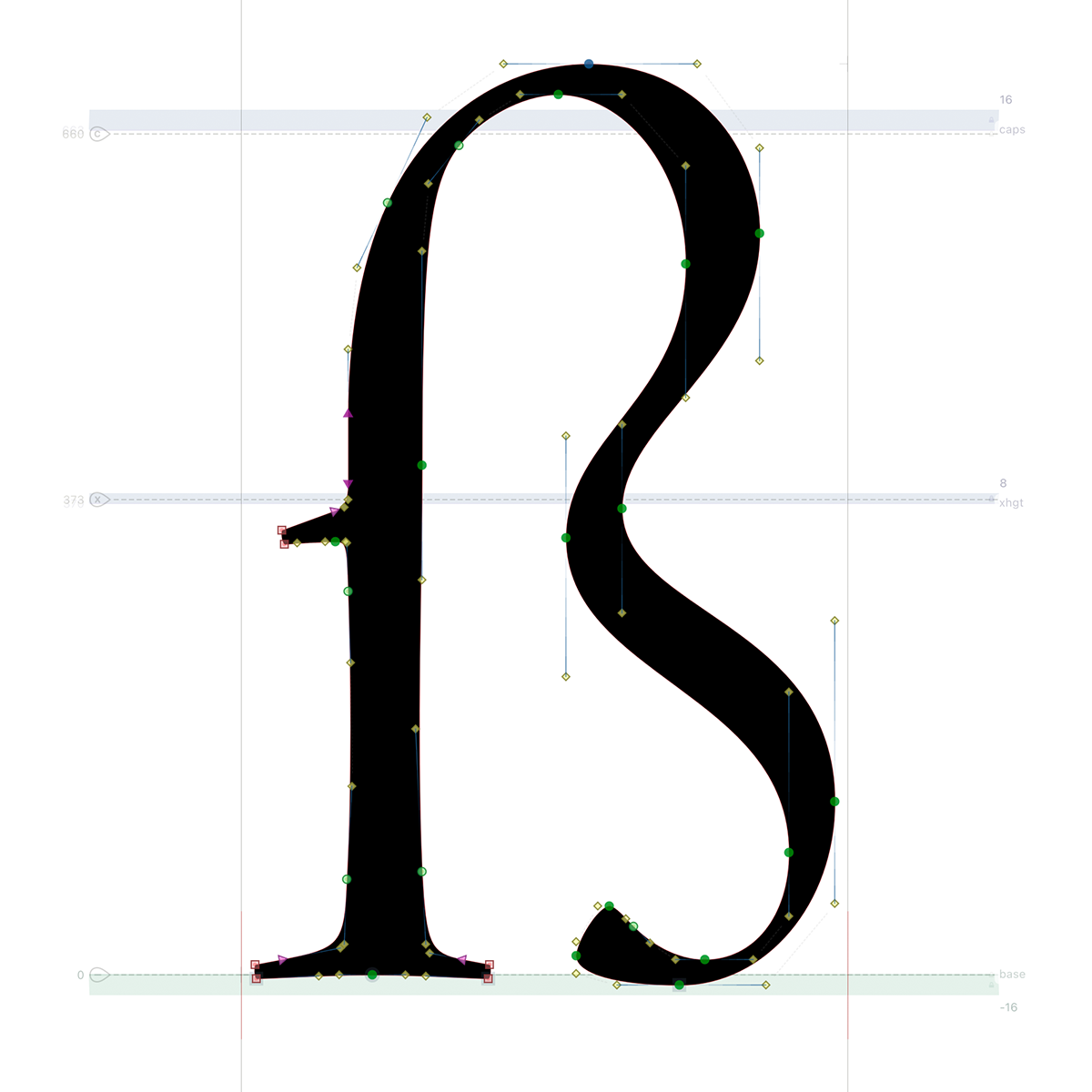
Throughout the development of the optical characteristics of P22 Stickley 2 the challenge was to create designs that felt the same while in-use, but were actually quite different in execution. The blending of the physical needs of size against optical perception (to fool the eye and appear the same), and then balance the design look-and-feel where every glyph needed to be redrawn for each size to keep everything feeling holistic, was an educational, though laborious, endeavor.


Design: Development and Execution
The original design, P22 Stickley Pro, is a digital-native design. Its initial development, growth, and refinement started with the text size, then adding the other optical sizes. The whole project was started and finished digitally; pencil never hit paper.
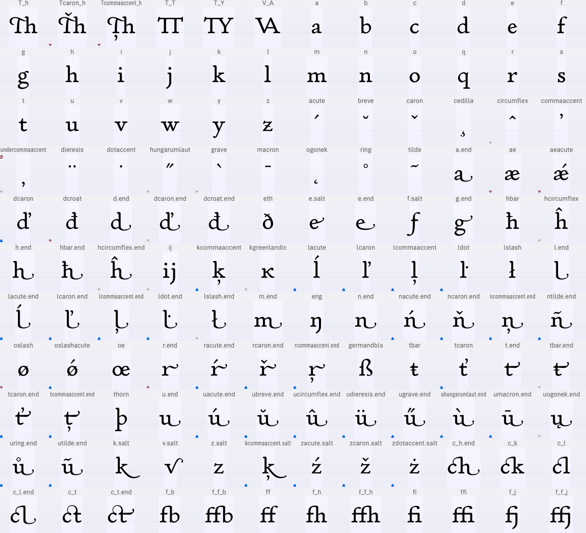
P22 Stickley 2 is a multi-year expantion and refinement of the whole of P22 Stickley Pro. All glyphs were redrawn from the original sources and new optical masters were defined to enable fully variable fonts. Cherokee, Cyrilic, and Greek scripts were added, as well as new weights and optical size across all styles.
P22 Stickley 2 is a multi-year expantion and refinement of the whole of P22 Stickley Pro. All glyphs were redrawn from the original sources and new optical masters were defined to enable fully variable fonts. Cherokee, Cyrilic, and Greek scripts were added, as well as new weights and optical size across all styles.